Color is the most immediate visual signal in beauty packaging, and for high-end brands, color precision is non-negotiable. The science of color matching in packaging involves understanding how materials, surface finishes, and manufacturing processes interact to produce the final perceived color. A Pantone color reference that appears consistent on paper can shift dramatically when applied to glossy ABS, matte PP, or translucent PETG. This material-dependent color shift occurs because different plastics have varying refractive indices, surface textures, and base tints that alter how light interacts with pigments. For high-end beauty packaging, color matching must account for these material interactions from the design phase, not as an afterthought during production. The complexity increases when multiple components in a single product line use different materials but must present a unified color story across the range.
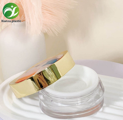
High-end beauty packaging typically references Pantone Matching System (PMS) colors as the standard for color specification. However, achieving a Pantone match on plastic packaging is fundamentally different from achieving it on paper. Key considerations include: (1) the base material color, which ranges from pure white for virgin ABS to slightly grey or yellow for PCR blends; (2) the colorant system, whether masterbatch or liquid coloring, which affects dispersion and opacity; (3) the surface finish, where glossy surfaces deepen color saturation while matte finishes lighten perceived color by 10 to 15 percent. Brand quality standards should specify Pantone references alongside acceptable Delta E tolerances, typically 1.5 or below for high-end packaging. Delta E measures perceptible color difference, with values above 2.0 being visible to most observers. Establishing these tolerances contractually with the supplier before production begins prevents subjective color disputes during quality inspection.
Different packaging materials exhibit distinct color behaviors that designers must understand. ABS provides the most accurate color reproduction because its opaque base allows masterbatch pigments to display true to specification. PP has a semi-crystalline structure that can cause slight color shifting, particularly in thicker sections where crystallinity increases. PETG and acrylic offer transparency that can be tinted but cannot achieve fully opaque colors without significant pigment loading. Metallic finishes through electroplating or vacuum metallization create reflective surfaces where color perception changes with viewing angle. For multi-component packaging where, for example, an ABS cap must match a PP tube, designers should specify color targets for each material separately rather than expecting a single Pantone reference to produce identical results across materials. Supplier capability testing should include producing color chips on the actual production material for designer approval before mass production commitment.
The surface finish applied to beauty packaging dramatically affects color perception. A glossy finish increases color saturation and depth by reflecting light specularly, making colors appear richer and more vibrant. Matte finishes scatter light diffusely, reducing saturation and creating a softer appearance. Soft-touch coatings add a slight white haze that can shift cool colors warmer. Frosted finishes, achieved through mold texturing or chemical etching, create a translucent effect that lightens color perception. For high-end packaging where multiple finishes may be used across a single product line, designers should create a color specification matrix that accounts for each finish variant. This matrix specifies the adjusted color target for each finish, ensuring that a matte compact case and a glossy tube cap present as the same brand color despite different surface treatments. Requesting physical samples of each finish variant from the supplier is essential, as digital color previews cannot accurately simulate tactile surface effects.
Maintaining color consistency across mass production batches is a persistent challenge in beauty packaging. Key quality control practices include: (1) establishing a master color standard, approved by the brand, that serves as the reference for all production batches; (2) implementing spectrophotometer measurement at the material inspection stage, before colorant is added, to detect base material color variations; (3) conducting Delta E measurements on samples from each production run, comparing against the approved standard; (4) maintaining detailed production records linking colorant batches to final product batches for traceability. Suppliers with in-house quality control laboratories and spectrophotometer equipment can provide measurement data with each shipment, giving brands documented evidence of color compliance. For high-end brands where color consistency directly impacts shelf presence and consumer perception, investing in a supplier with strong color management capabilities is a strategic decision that protects brand equity over the long term.
Q: What Delta E tolerance is acceptable for high-end beauty packaging?
A: For high-end beauty packaging, a Delta E of 1.5 or below is the industry standard. Values between 1.5 and 2.5 may be acceptable for non-primary brand colors or secondary components. Anything above 2.5 is typically visible to consumers and should be rejected during quality inspection.
Q: How do I match colors across different packaging materials?
A: Specify separate color targets for each material rather than using a single Pantone reference. Request physical color chips produced on the actual production material from the supplier. Test colorants on each material type before mass production, as the same masterbatch produces different results on ABS, PP, and PETG due to material opacity and refractive index differences.
Q: Why does my packaging color look different from the approved sample?
A: Common causes include material batch variations, changes in surface finish between samples, ambient lighting differences during inspection, and masterbatch aging. Establish standardized inspection conditions with D65 lighting, maintain a master color standard, and require spectrophotometer measurement data from the supplier for each production batch.
|
Finish Type |
Color Saturation |
Lightness Shift |
Best Color Application |
|
Glossy |
Increased depth |
Darker perception |
Bold, vibrant brand colors |
|
Matte |
Reduced saturation |
10-15% lighter |
Soft, natural tones |
|
Soft-touch |
Slightly muted |
Slight warm shift |
Premium neutral palettes |
|
Frosted |
Translucent effect |
Lighter, diffused |
Pastel and tinted colors |
|
Electroplated |
Angle-dependent |
Metallic reflection |
Accent and trim elements |


 EN
EN